Poster Series
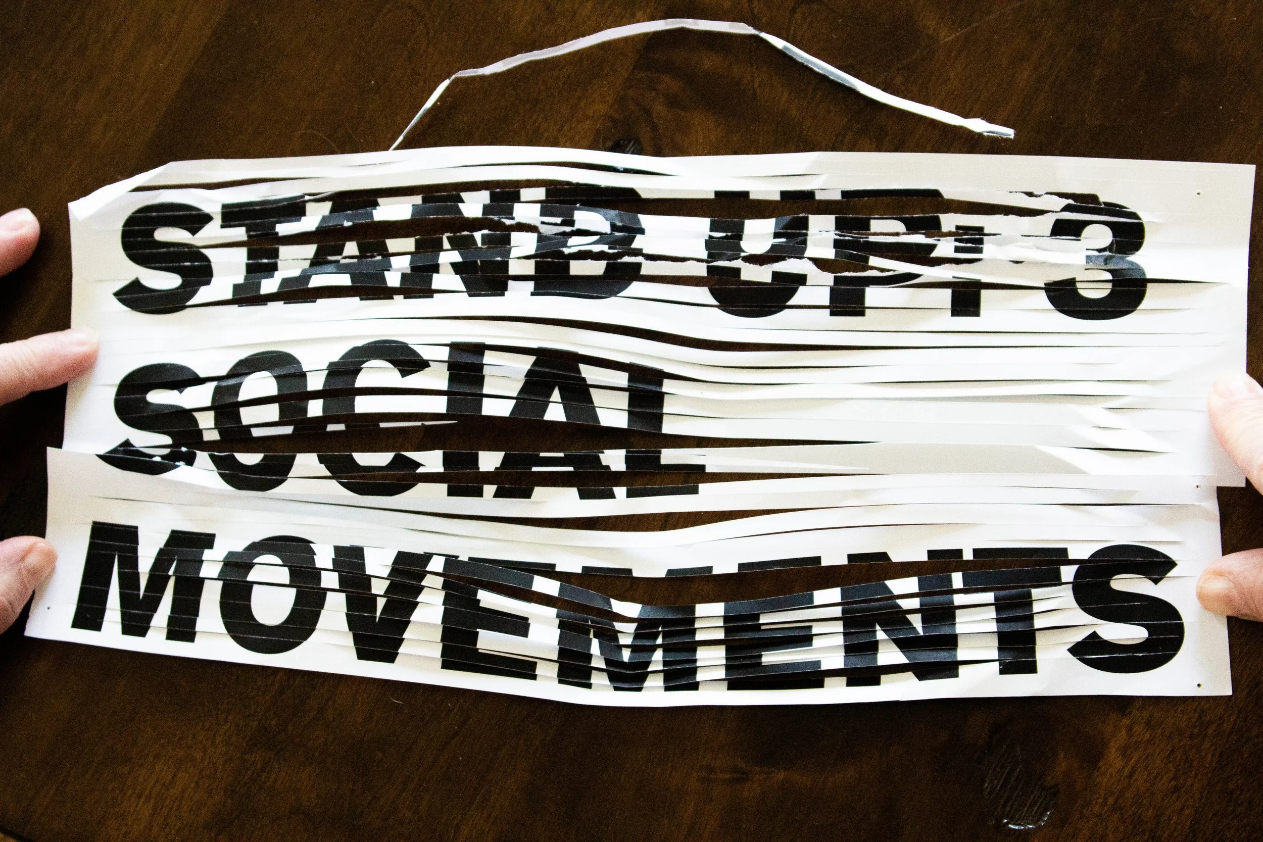
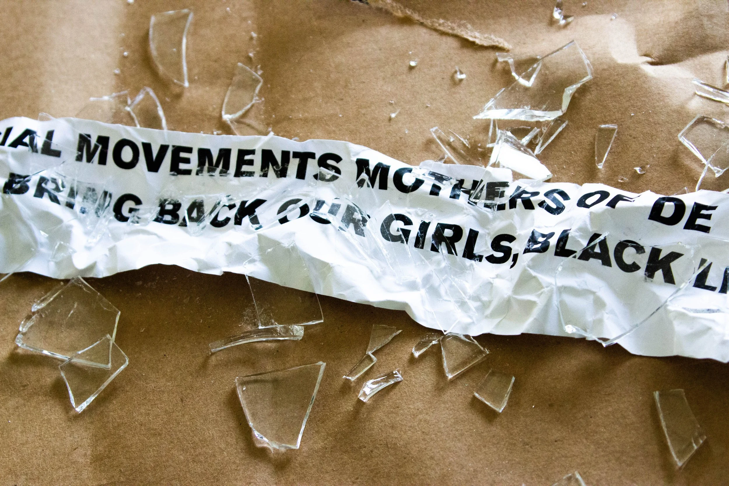
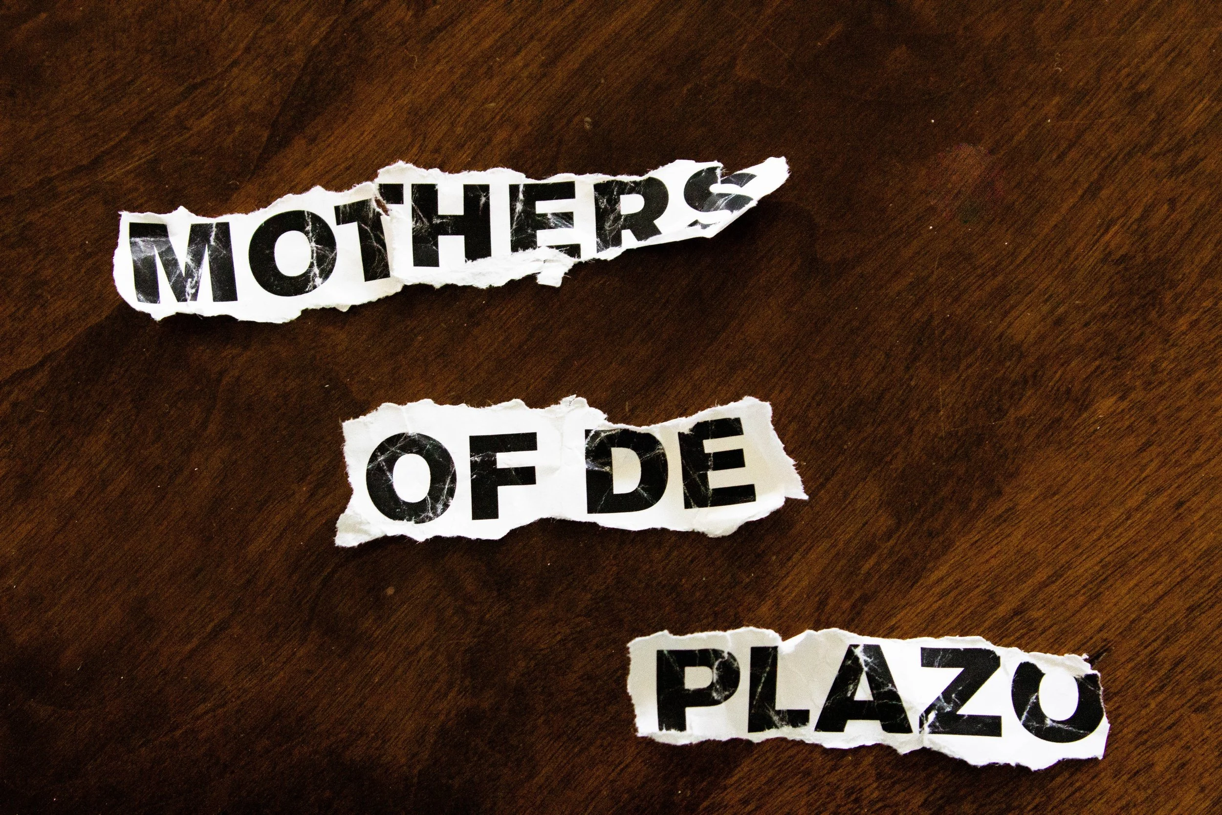
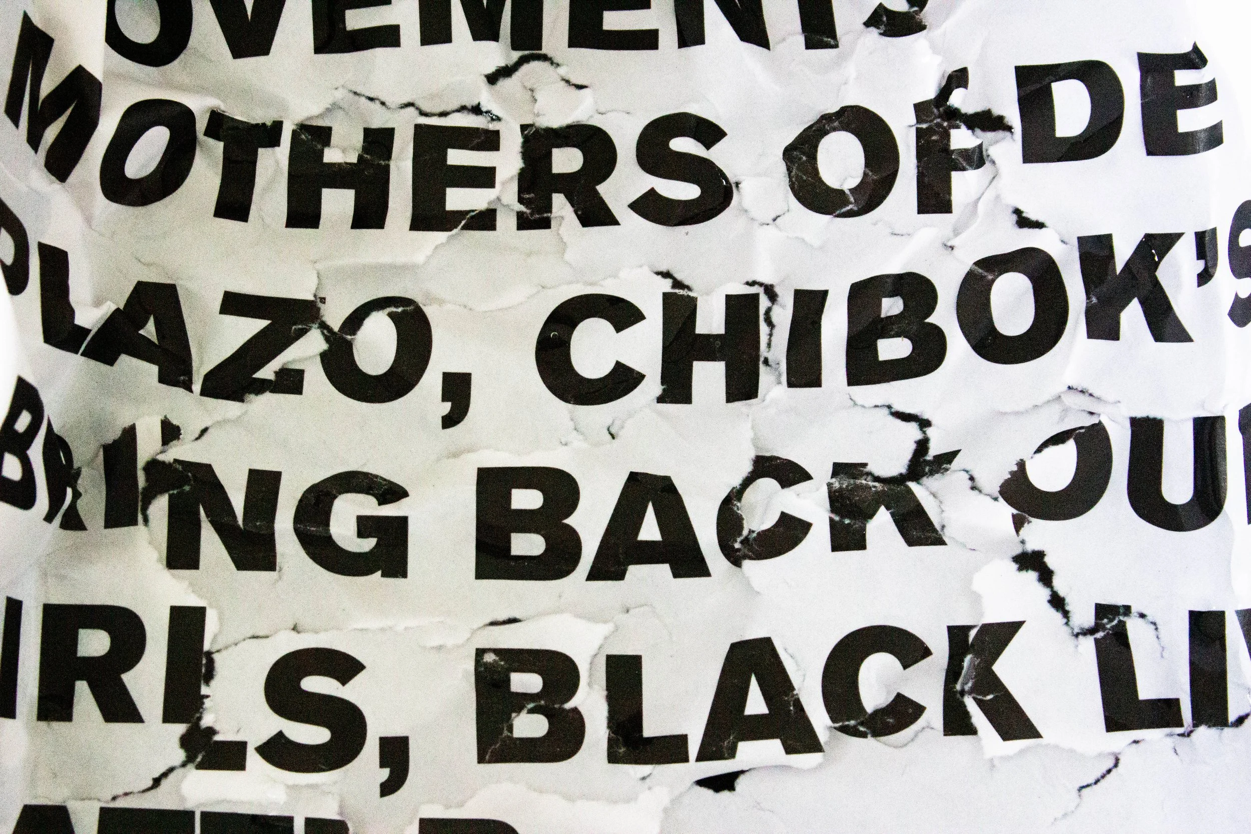
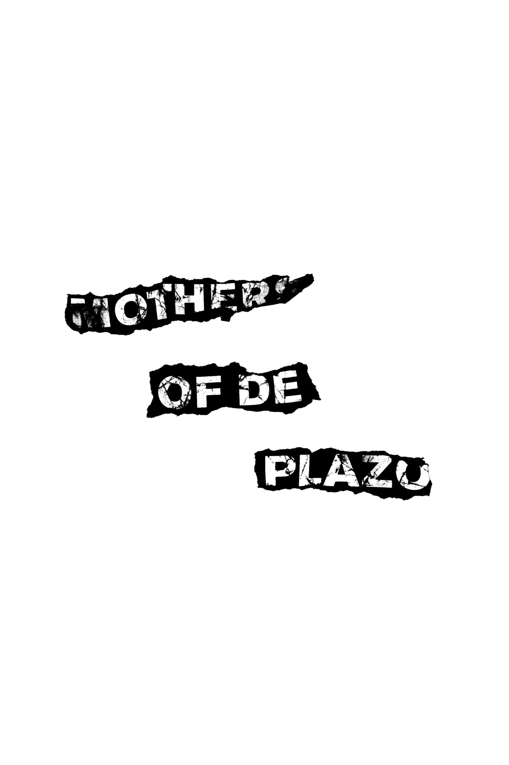
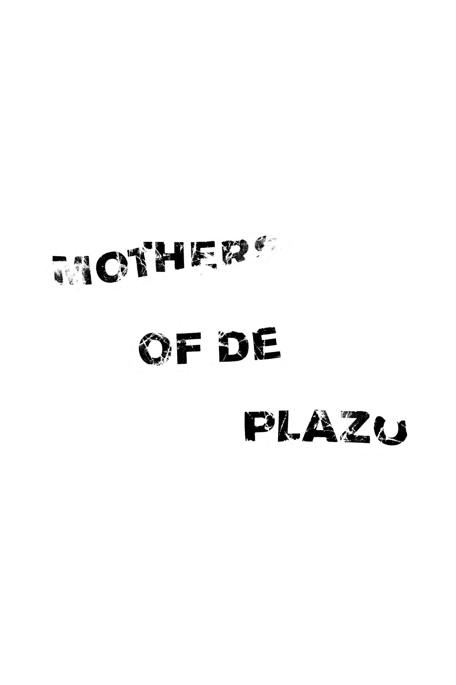
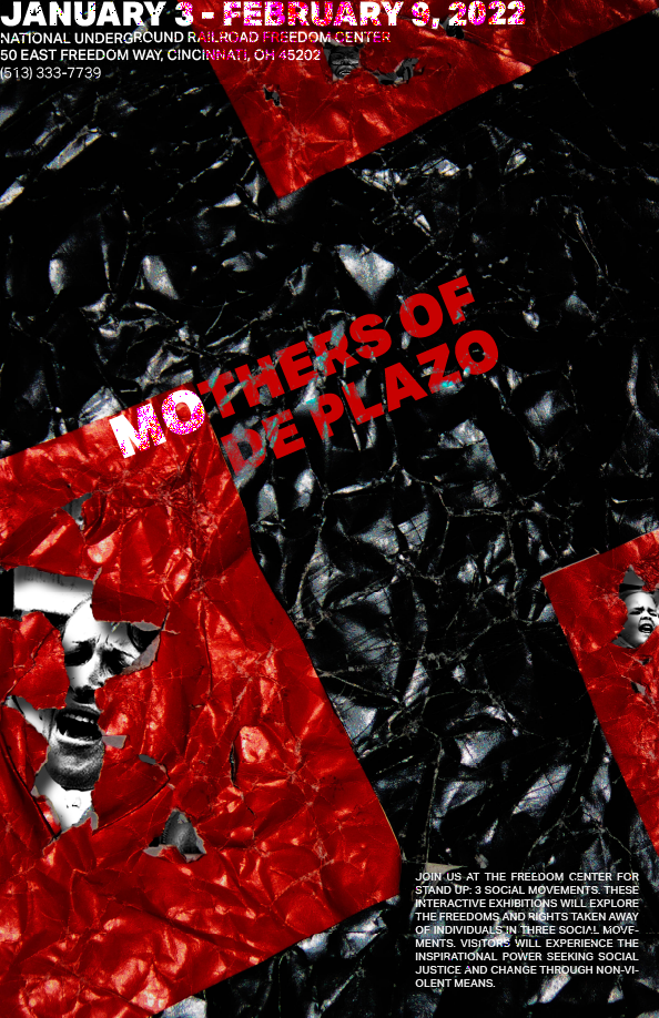
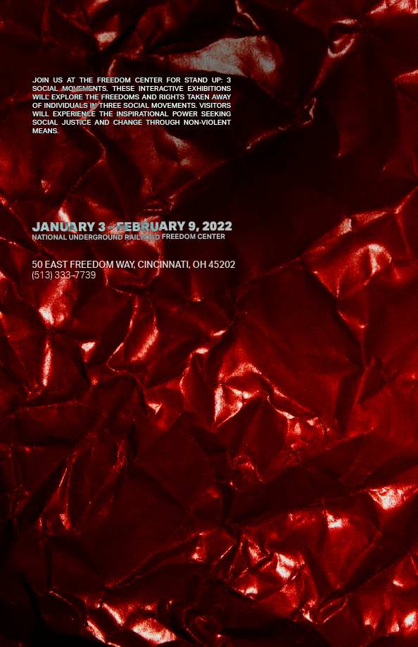
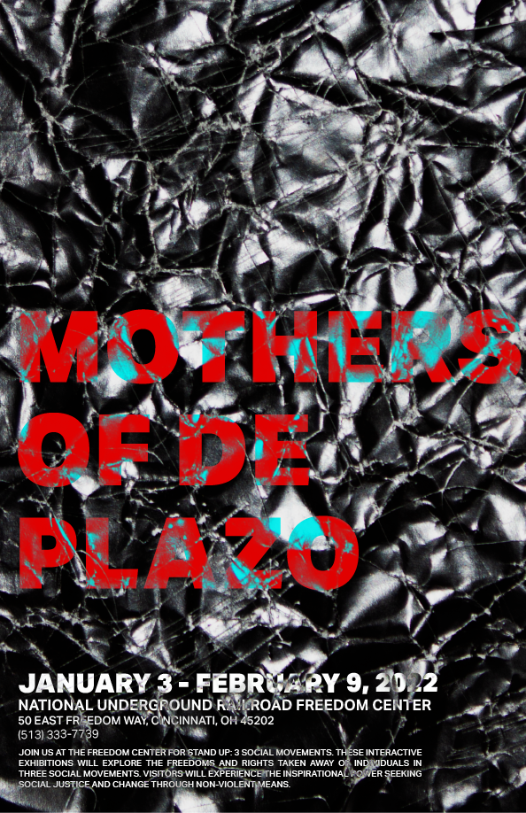
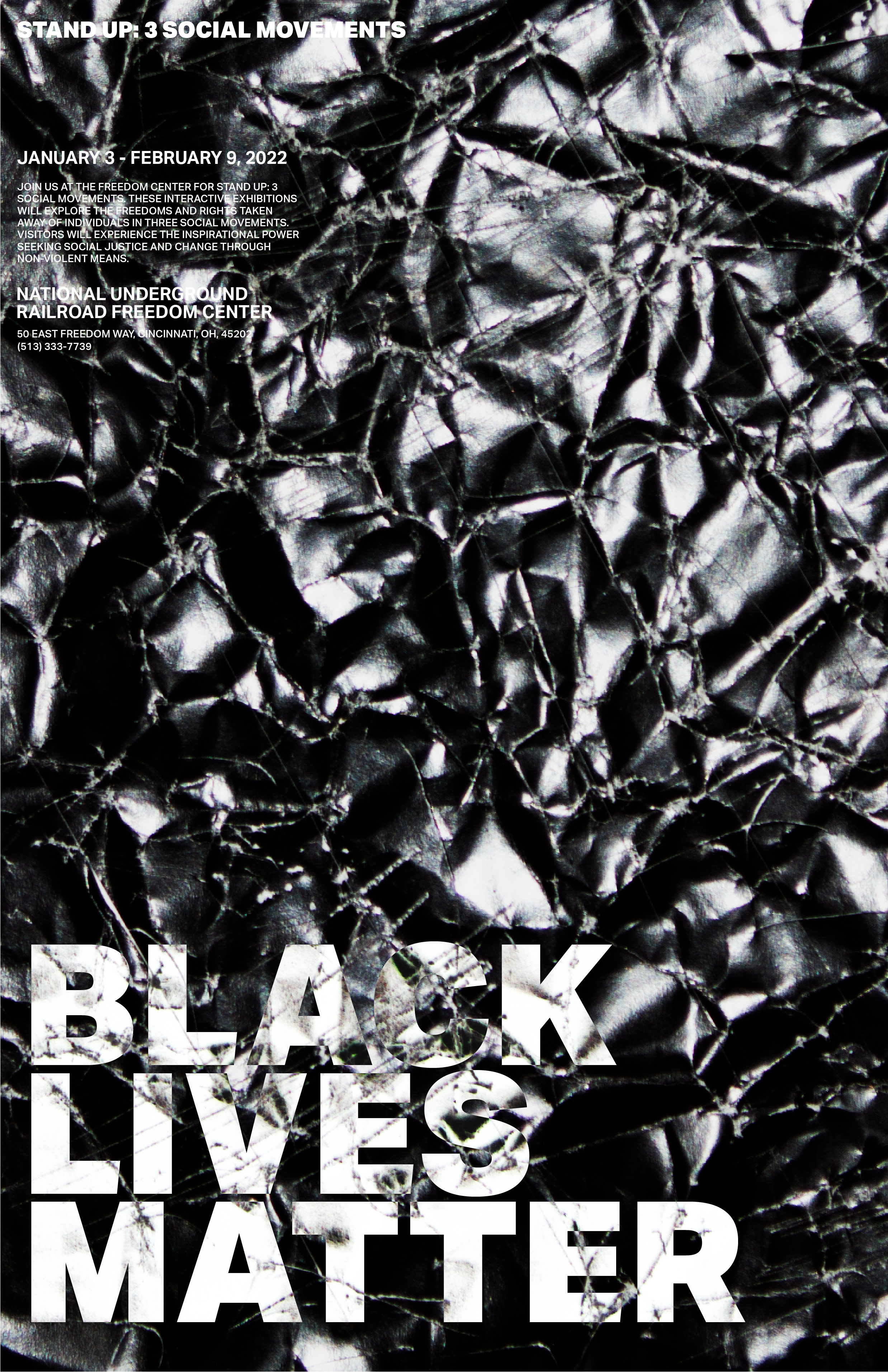
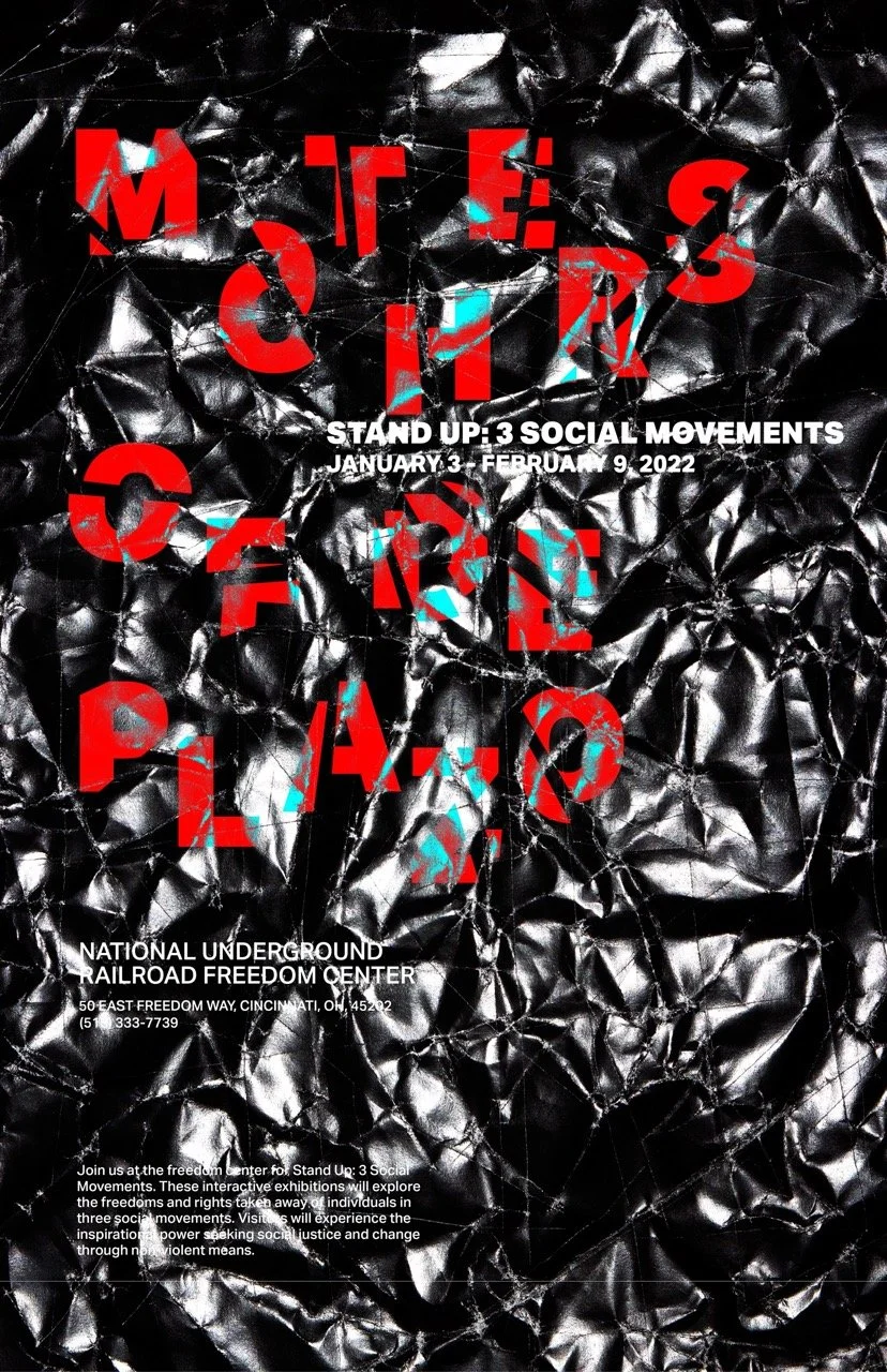
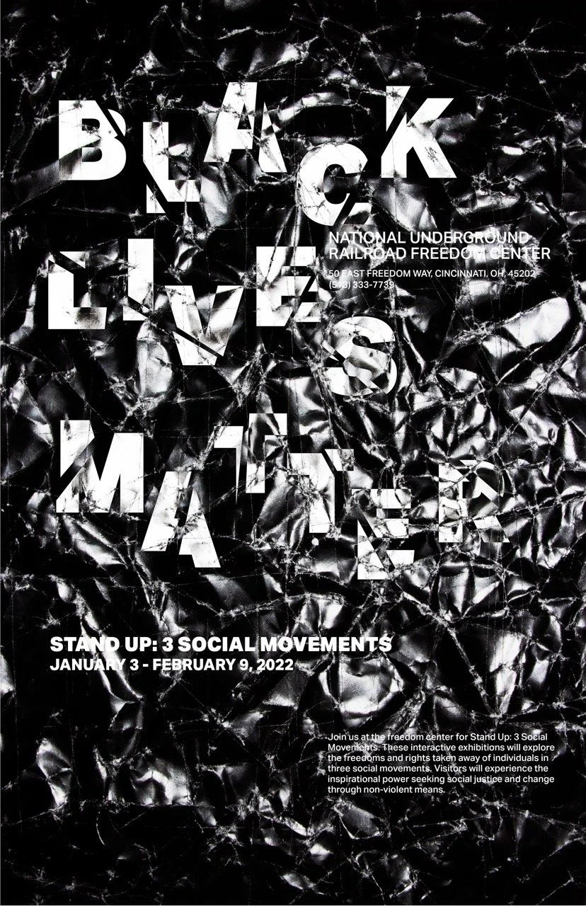
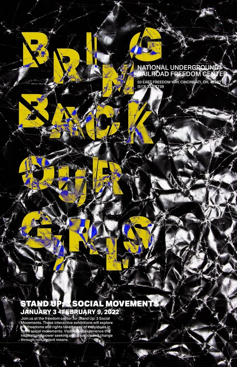
For this project, we were assigned to create an effective visual system focusing on typography and image to convey messages through a poster series. This poster series demonstrates the ability to research, communicate messages and ideas visually, and to create a unifying visual system with different components. When approaching this project, I knew that I wanted to show harshness and severity. I did not want it to look aesthetically pleasing or pretty; I wanted it to be messy. Having one’s identity stripped away from them is not a happy concept and it never should be.
Concept Experimentation
Concept Variations
Final Poster Series
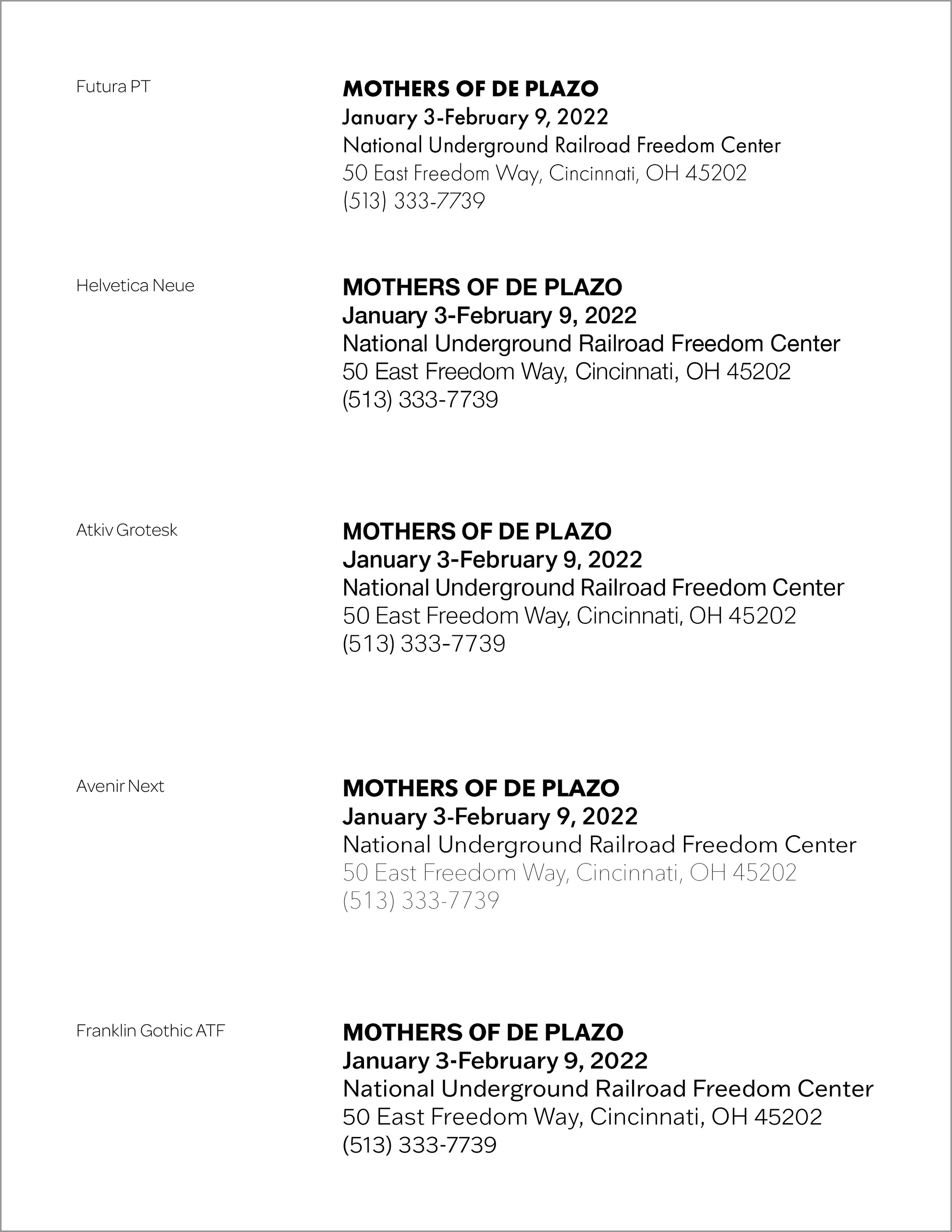
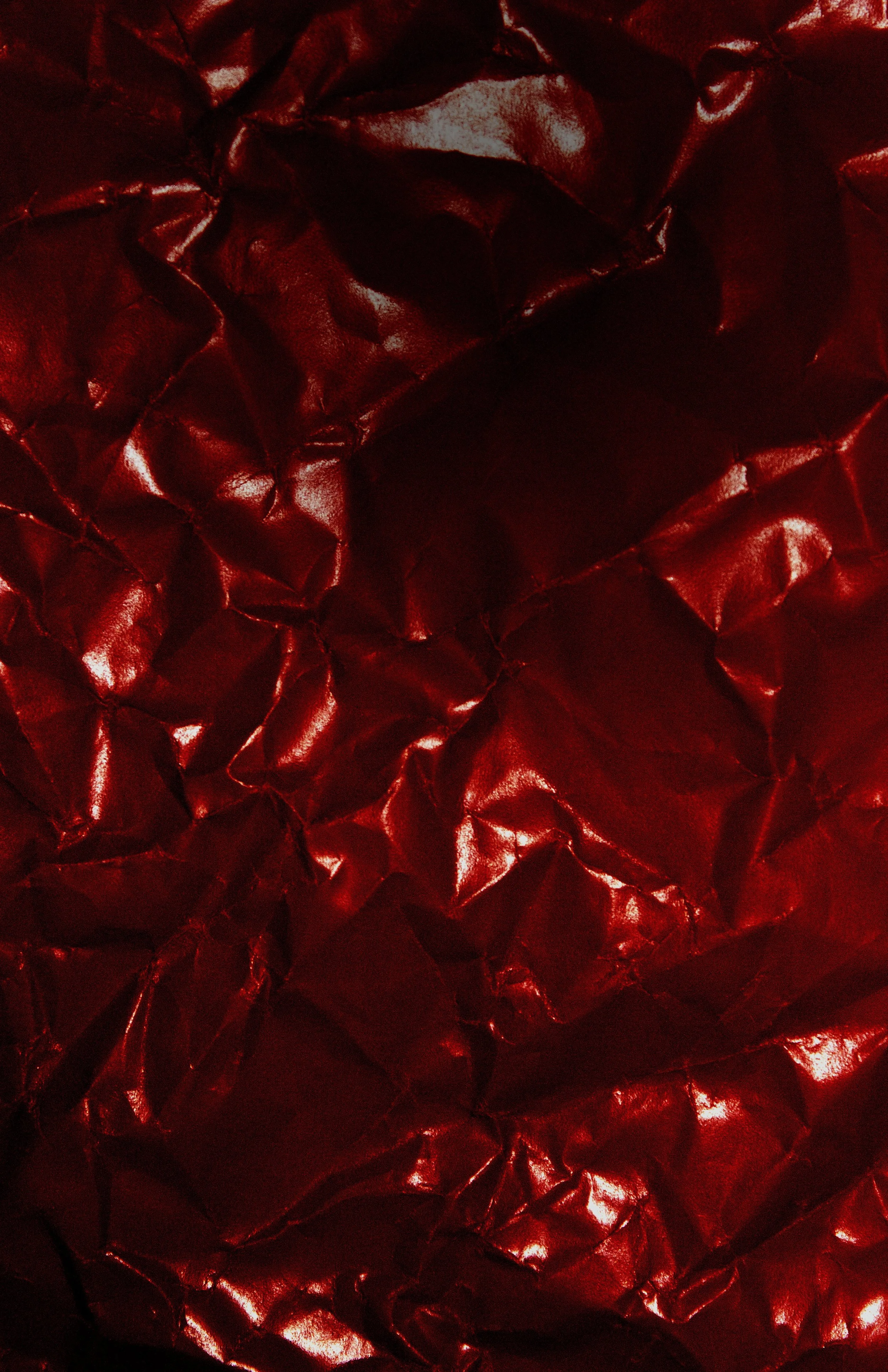
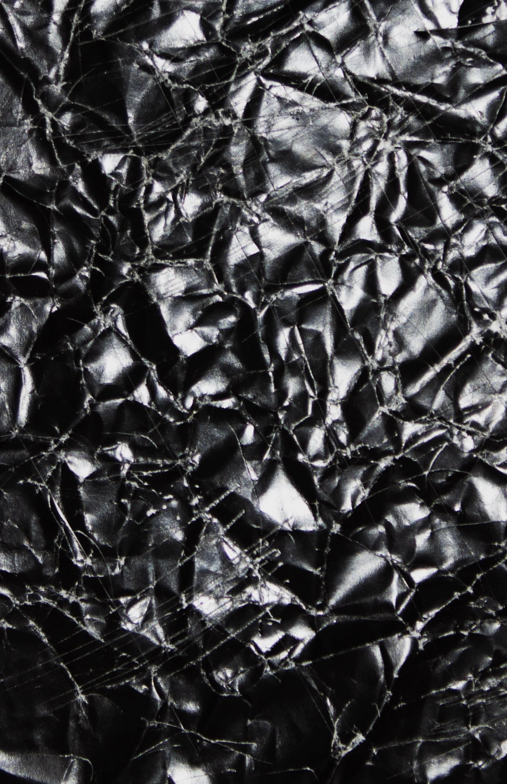
To create the background, I crumpled up black paper and scratched it up with an X-acto knife. The scratches and crumpled up effect provided texture and a sense of uneasiness and messiness. To have an intentional and cohesive color scheme, I used primary colors with the addition of white. I chose the typeface Atkiv Grotesk because of its boldness, quiet authority and ability to support my message without overpowering it. A 5 column grid system was applied to align the remaining type, such as: the title, body copy, place, date and time.


